Brand clarity is the most overlooked growth lever
As companies plan their marketing investments, the instinct is often to focus on tactics—new campaigns, more content, another platform.
But the most effective growth lever I see across medical device, manufacturing, and SaaS organizations is far more foundational: brand clarity.
When your brand isn’t clear or consistent, even strong marketing efforts struggle to gain traction. Sales teams improvise. Messaging shifts between channels. Prospects feel friction, even if they can’t quite name it.
Brand clarity creates alignment. It ensures your website, sales materials, presentations, and campaigns are telling the same story—clearly and confidently.
Here are three questions worth asking before investing in your next initiative:
-
Can your leadership and sales teams articulate the same value proposition?
-
Do your visuals and messaging feel cohesive across digital and print touchpoints?
-
Does your brand reflect where your company is going—not just where it’s been?
When those answers are unclear, marketing works harder than it should.
Clarity doesn’t require a full rebrand every time. Often, it starts with assessing what’s working, what’s outdated, and what’s creating confusion—then building a system that supports growth.
If brand consistency has been on your mind, this is often the best place to start.
What I’m reading lately…
Interested in what’s trending in design? I recently read this article from Adobe on what they are seeing in 2026.
Here’s the lowdown:
-
All senses, to the max (tactile and sensory experiences)
-
Exaggerated, playful letters and text (think puffy letterforms)
-
Immersive, high-energy style (bright, saturated color palettes)
-
Surreal and absurdist imagery (collage-style compositions)
-
Organic and imperfect design (hand lettered and letterpress style fonts)
-
Freeform and storytelling layouts (playful controlled chaos)
-
Warm, personal visual style (human-centered design)
-
Local and cultural flavor (patterns and symbols rooted in heritage)
-
Collage and layered visual elements (overlapping layers and mixed media)
-
Maximalist chaotic layouts (more is more philosophy)
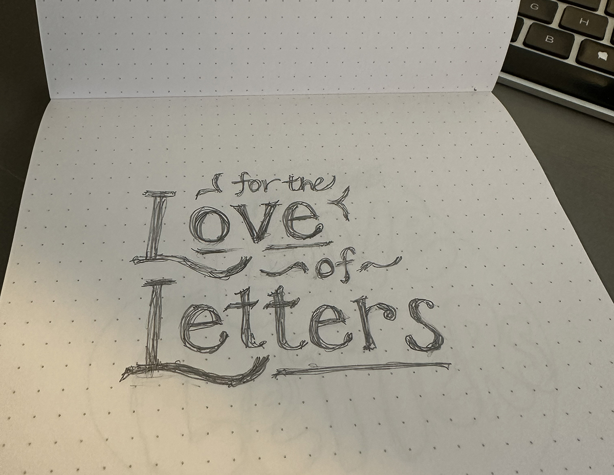
Again, speaking to clarity here. Just because these items are trending doesn’t mean these design elements should be brought in when it doesn’t align with your brand. I’ve been taking some hand lettering courses (see sketch below) so #5 piqued my interest. I’m envisioning a use for these trends on internal communications posters, as an example.
Not sure how to incorporate or curious to learn more? Reach out and let’s chat to see if it’s appropriate to infuse any of these trends into your brand!