Less is more.
The message “less is more” is now everywhere. From Marie Kondo, to minimalism, to sustainability. But it has been yielding results in marketing for decades.
When creating an effective marketing piece, there are many things in a designer’s toolkit. Some are proven psychological and design practices like how visual elements influence where viewers’ eyes travel and rest, and how color and white space impact an audiences’ ability to read and remember. All often rely on the principle of less is more.
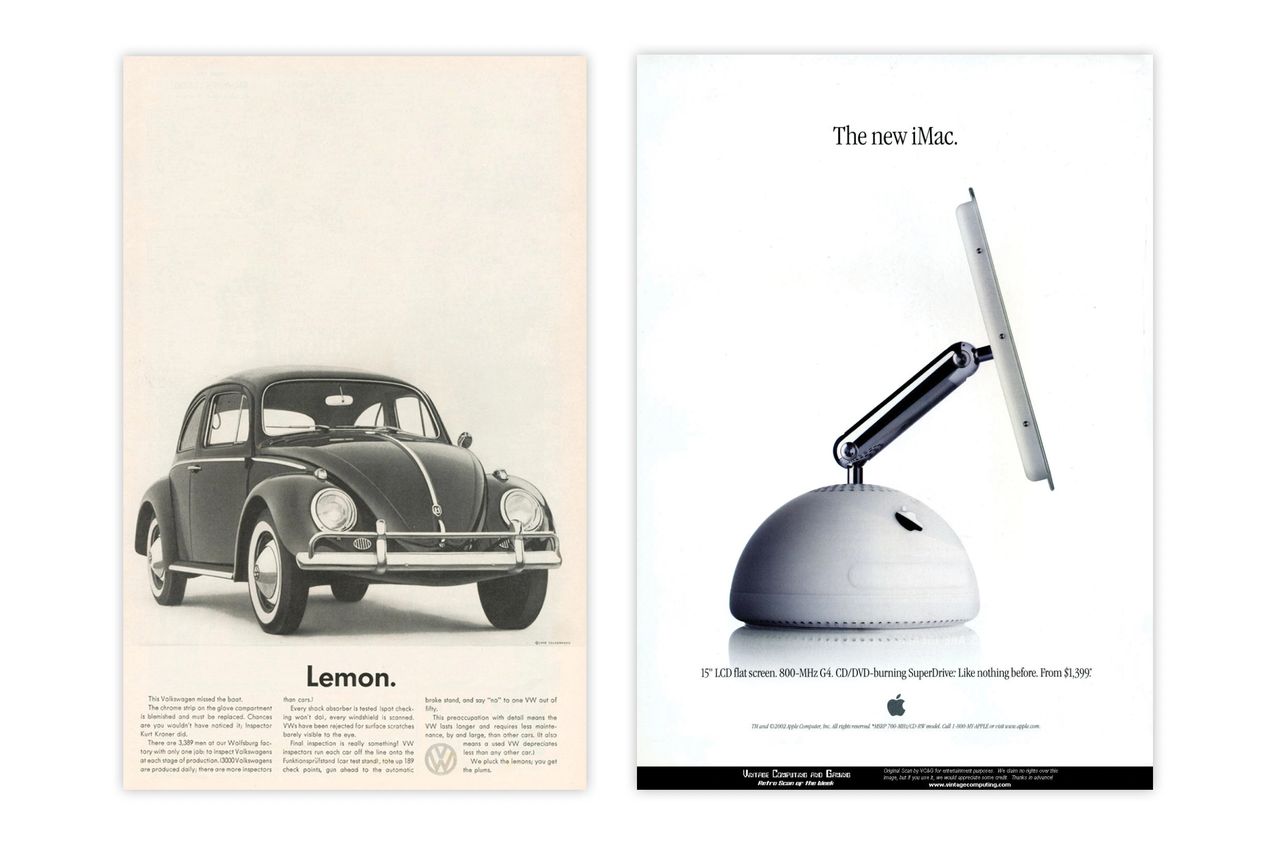
These vintage ads from Volkswagen or Apple are great examples. People are naturally drawn to the simplistic design – it’s easy to read and understand. The logo is subtle, but you can recognize the brand even if you omit it. These brands are instantly recognizable due to a consistent use of imagery, plenty of white space, clean typography and concise copy. It is great branding and leads to recognition and memorability. Less = more.
This is one of my favorite quotes about this effective concept:
The ability to simplify means to eliminate the unnecessary so that the necessary may speak. ~Hans Hofmann
When I’m asked to make a logo larger or add more copy, this saying often comes to mind. Aside from the design rules learned through years of training and experience, “more,” “bigger,” and “brighter” don’t yield results. The message — tailored to a product or service – is key. It tells the target audience how it can meet their need or solve a problem. The logo is secondary, It is a valuable asset to your brand and strategy, identifying your company and reputation.
These two elements help create effective visual communication that leads to new customers and reminds current ones of how your product or service meets their needs.
Here’s a sample ad project I created for another client in the manufacturing industry:

If you need help creating an ad to feature a new product, service or other initiative at your organization, call me to find out more about my process and to see if we’d be a good fit!
All the best,
Jen